


Laetitia Yhap: Longings and Belonging
Laetitia Yhap
Size: 245 × 295 mm
Pages: 162
Language: Chinese & English
Binding: section sewing
Published by Tabula Rasa Books
First edition, July 2022
ISBN: 978-1-3999-2998-1
Author: Laetitia Yhap, Philip Dodd, Zhang Yuling
Editor: Yisi Li, Tanni Chen, Even Zhang, Deng Yixin
English Translator: Summer Sheng
English Proofreader: Even Zhang, Deng Yixin
English Editor: Yisi Li, Tanni Chen
Display typeface: Agipo
Laetitia Yhap: Longings and Belonging is a publication dedicated to the artist’s first retrospective exhibition in China and Asia.
HERE for more information about the exhibition
Design Notes by Twelve:
We are honoured to be commissioned by Tabula Rasa Gallery and Yanlan Art foundation to design Laetitia Yhap’s exhibition catalogue of Longings & Belongings. Her artistic expressions resonate with us greatly and her enchanting imagery not only gives us food for thought but also provides the fundamental structure of the design.
Books — as an object of craft — has the same cultural longevity as paintings, with luck, it will survive in homes and libraries in decades if not centuries to come. The physicality of it as an object should be as emblematic of the artist as its reproduced artworks. In another word, rather than conceiving the object to be either grand or fashionable, we designed the catalogue to be appropriate and relevant to the artist. This is achieved by a series of meaningful and judicious choices on format, material and production methods, guided by our reading of her artistic integrity.
The form of an Identity
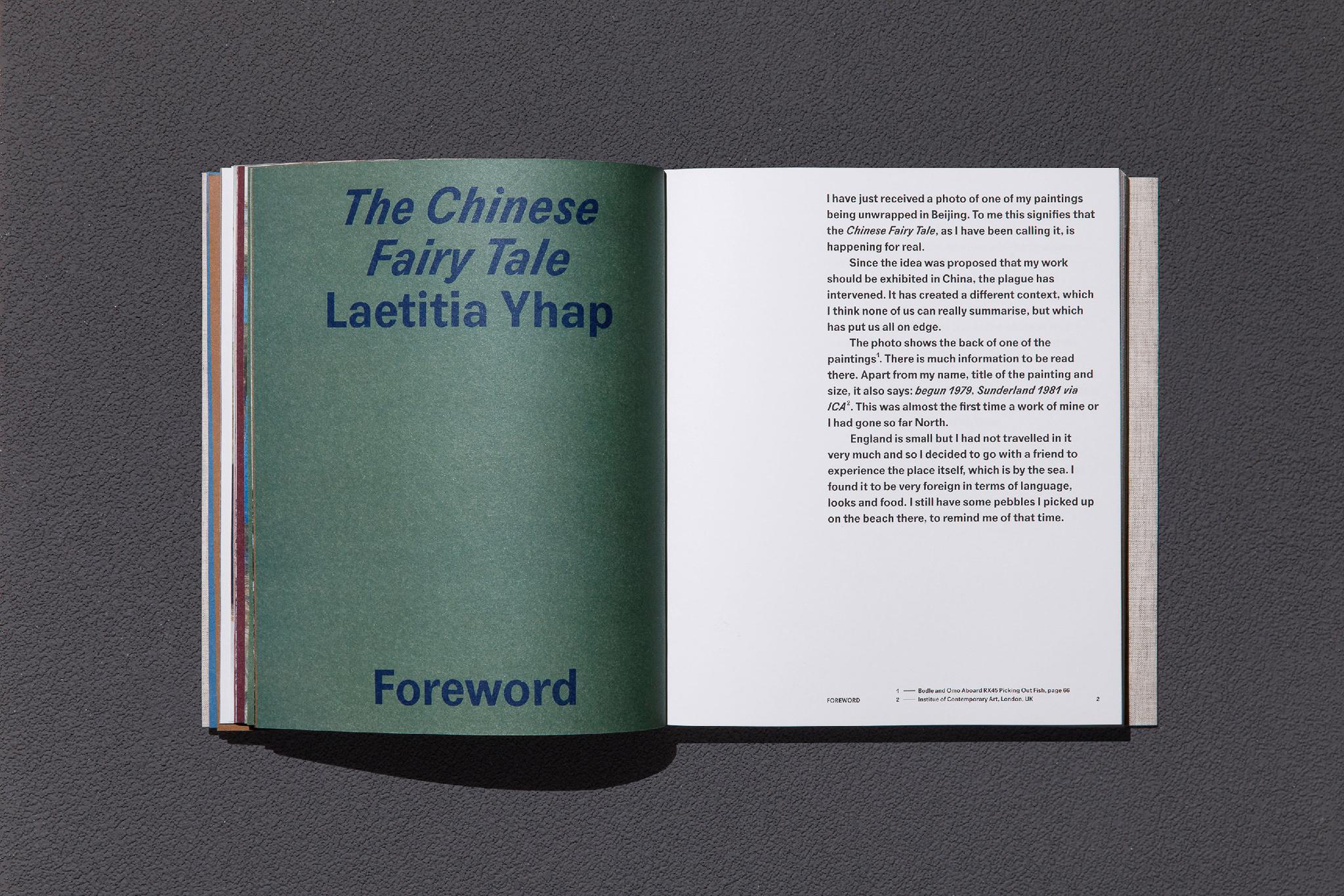
In one of the interviews with Laetitia, she mourned the demise of the traditional fishing industry, to a degree which she cited it as being one of the reasons of why she stopped painting, particularly to coincide the replacement of the wooden fishing boats with steel alternatives. In one of the photographic inserts, Laetitia is seen painting the identity number on the boat — A similar number can be seen in the painting Bodle and Omo Aboard RX45 Picking Out Fish — the caption of the insert reads:
‘Laetitia painting the numbers on their boat: RX 316. It was in 1983 and the man in the boat is Michael Rycroft. Laetitia was pregnant with their son Ajax. They named the boat after him.’

As the essays and interviews in the book pointed out, as a child of mix heritage and extraction, after her tumultuous upbringings, her study at the Slade and tours in Italy, Yhap found a sense of belonging in Hasting. Perhaps by chance, or perhaps by a sense of inevitability, fishing boat becomes a subject matter of her art and an allegory of her identity, the fishing boat bobbing about in the choppy sea with a large painted name, a metaphor of an identity that is rooted somewhere but belongs to nowhere.
In the typography, we decided on the typeface Agipo by Radim Peško, it has a formal appearance with vernacular paintly details, we typeset it large to echo the painted number on the boat, the paintly notion is not only in a graphical sense but also in print production: all large letters are set in overprint, overlaying with the ground colours that are taken from her frames, subtly changing over the pages. Agipo also has a forcefully oblique italic set, setting in long and large text, they have the appearance of a tidal, we further extended the tidal motif in the page number of the plate section, whilst flipping through the pages, the number moves in the motion of a wave.
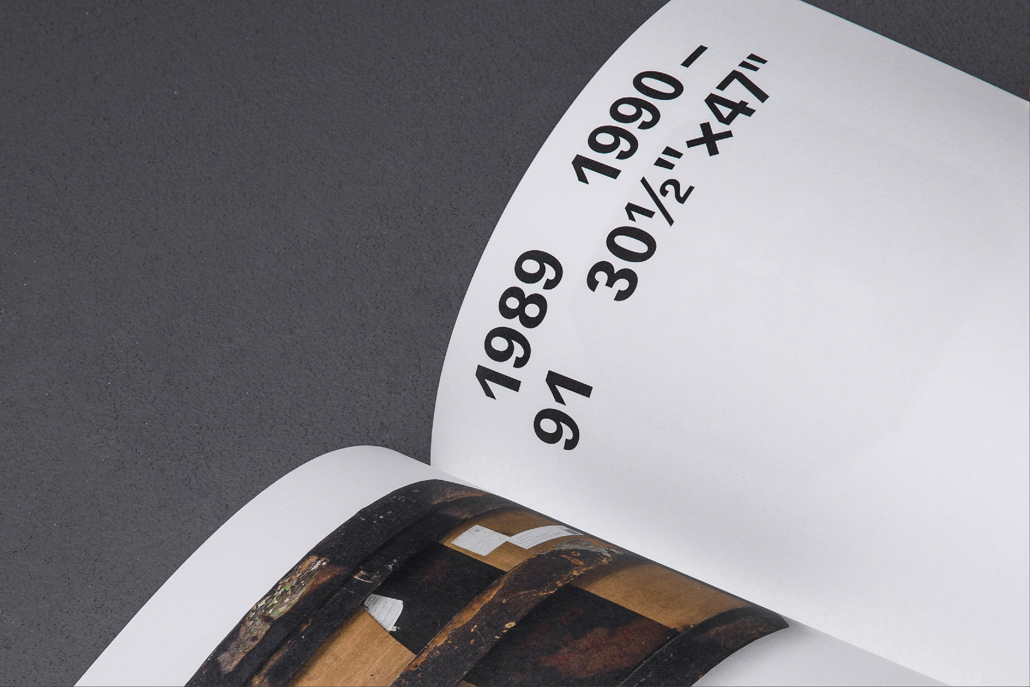
In studying the artworks, we noticed the back of the painting as evocative as the front: hull-like stretcher construction made by the artist and scribbled with cryptic numbers, they are a part of the story of identity. With the permission of the gallery, we photographed both the recto and verso of each painting and transcribed the annotated numbers in large.
The Practical and the Emotional
There are some preconceived notions of what an artist catalogue should be: a quarto with gold-foiled hardcover, dust-jacketed for advertising, heavy-grade plasticesque coated paper bound in sections, hefty, makes a great thumping noise, they are all for sound economic sense and good practical reasons. Yet they do not show empathy of the artist it represent — Bog-standard specifications for great maestros. For Laetitia, we tailored the quarto specifically to her artworks, proportionally wider for the paintings which are often in square or in landscape format, it allows the plates to be set proportionally in scale — small paintings appear to be smaller and large one large. We also reduced the weight of the book as much as possible whist increasing the thickness. With high-bulk substrates, it has the physicality of a floating boat than a sinking brick. The uncoated library-grade acid-free paper is supple in tatcility and yet durable for long-term storage, jacked in linen cloth and screen-printed in blue, it is formal yet personal.
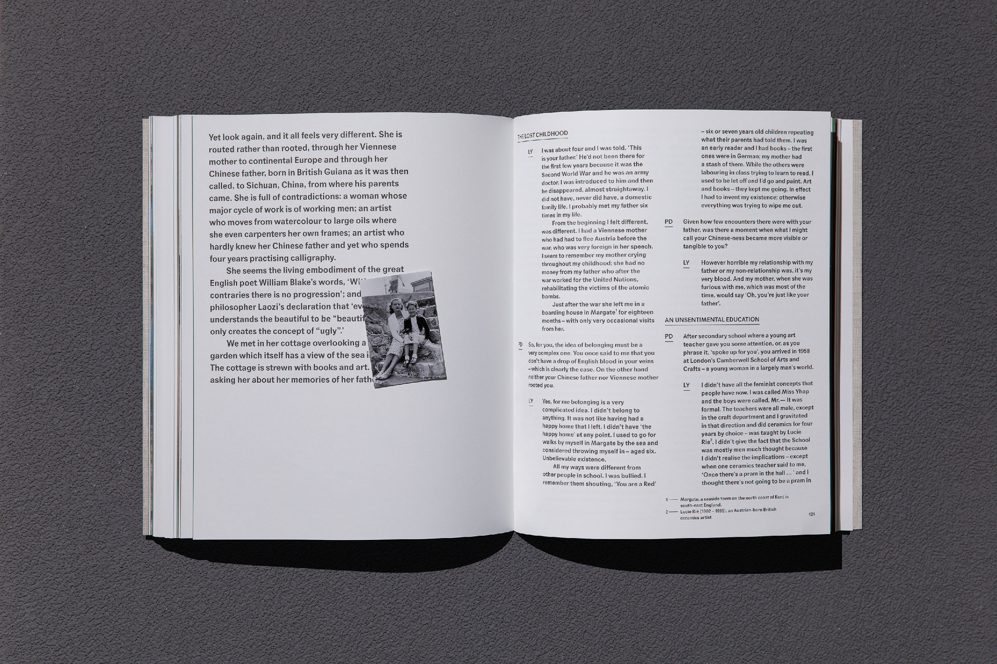
In layout, particularly in long-form bilingual layout, having both languages side by side is often unsatisfactory and unsympathetic to both contents, it feels cold and uncared for as if it is a muitiligual appliance manual. While treating each language with due respect, giving each ample space to breathe, one often has to repeat the referenced images even they are independent of the linguistic preferences. In the interview chapters, we placed Laetitia’s photo with her mother as an insert in the English section whilst Yhap’s photo of her father in the Chinese, not only making the placement relevant and empathic, the removable insert also serves as a practical design solution.
Lastly, as designers, we are consciously aware of the fact that our artistic expressions should not become an imposition or divergence of artist’s intent. For a book design, is not dissimilar to the frame of a painting, it needs to feel like doing the least with the greatest care, this is no more apparent than in typography. Our text layout might look inevitable, plain, matter-of-fact, but if the reader compares the textual quality of the large letter ‘G’, one will notice that it is alternating with a vertical stroke and without, in a micro-mosaic way, it becomes a metaphor of the artworks: the small paintings with miraculous brush strokes, the imposingly large paintings with mutitude of details, the hull-like stretchers hidden behind the paintings. We are hiniting at the journey of observation, encouraging the readers to see closer and reflect deeper, and hope they will be rewarded with the revelation of a discovery.
Tabula Rasa Gallery (London)
Unit One, 99 East Road,
Hoxton, London
N1 6AQ
Unit One, 99 East Road,
Hoxton, London
N1 6AQ
Tuesday - Saturday 12:00 - 18:00 | Sunday - Monday Closed
© 2022 Tabula Rasa Gallery